

Welcome to the last few models for my Standish Standoff 2012 list. Also the last of my Grey Knights up until the writing of this article at least. I added "The Man" of the Inquisition, Coteaz. He is a heck of a deal for 100 points and brings a lot of function to a list. You all know this its been said before. So on to the important things. PAINTING! I opted to go with White armor. I wanted him to meld in with my purifiers but I felt the black armor was to flat and wanted to do something different. Turns out it gave me a cool grey/black/white color differential between my three inquisitors (see previous articles for the other two). The armor isn't the best to be sure it has some highlighting to it but not enough color depth to really do it justice. Still hadn't gotten into the whole idea that you need to start grey or dark grey to do white, but was starting with a very light grey base coat and going up from that. The washing helped to bring out the details and edgers in the armor so it at least worked somewhat. As stated some number of articles ago, I primarily use the reaper master series of paints. I like that they come in color trios, a shadow, a mid tone and a highlight. Helps to keep coloring the same across an army as your not mixing paint and for an amateur like me encourages me to actually do several layers of coloring.

What did work however is his red cloak. I think the depth of color on that really came out well and even photographs well. I've always licked this trio and worked it a lot with confrontation models. The blood angel coloring is a brighter red than this but I think this just comes out as a deep regal red. I used my traditional shortcuts for painting gold, painted everything a chestnut gold first as a base then put on the antique gold followed by a black wash. I do this so the gold goes on in one thin coat, the chestnut takes maybe one or two thin coats to cover even black. Its a yellowed brown so higher darker pigment count that covers well. I recommend this to anyone painting gold. Its a great shortcut and perhaps more attainable than using alcohol metallics. Used some basic dry brushing and washing to do the fur and feathers I find for organic materials these rough and ready painting styles work best as they introduce some flaws that all natural things have.

Next addition to the force was a Techmarine. I didn't have a specific role for this guy other than to get him to man the quad gun with his higher ballistic skill or provide a little support to a unit that needs it. I opted for a deeper red than even the cloak on Coteaz. I felt the martian red would be a deeper brick like red rather than a blood red that GW likes to use all the time. Once more edge highlighting would really transform this model, and when I paint up the other 2 I have I likely will go back to this model to touch it up then. I opted to use a lot of blue for counter coloring in picking out details. This helps him blend in with the Purifiers who have similar coloring on the Psi-cannons. I didn't do much with the servo harness. I ran out of inspiration as well as time and just needed to wrap him up for the event. Picked a few details out in gold and brass but mostly just bolter with a black wash. I think with the next ones I'll use some green with wiring as well and do more brass and copper int he harness to separate details. Also using a brown wash like agrax earth shade on different parts to put a machine oil texture to the model.


Alright last model for the week my Storm Raven. The paint scheme is somewhat generic and no grey knight bling is on this model as I planned to use it with my Blood angel force as well. I should have added the details would have helped me to break up the model. Once again we can see my struggle to paint large flat surfaces. I just don;t know how to give them color depth like with the cloak. Edge highlighting isn't a tool in my bag yet nor is using an airbrush for anything more than putting a single color down across the whole model. These days I like to use pre-shading along joints and edges before dropping that base coat down with a little surface blending to bring the color up (more on that in future articles). Then I go back and edge highlight. However that is now and this is still 3 years ago. I will say however that the canopy came out great. I did something like 12-13 colors blended across it and it just came out great. Super stoked with the end result. Helps to draw the eyes away from the crappy hull paint job and focus you on something bright and blue and actually painted well.


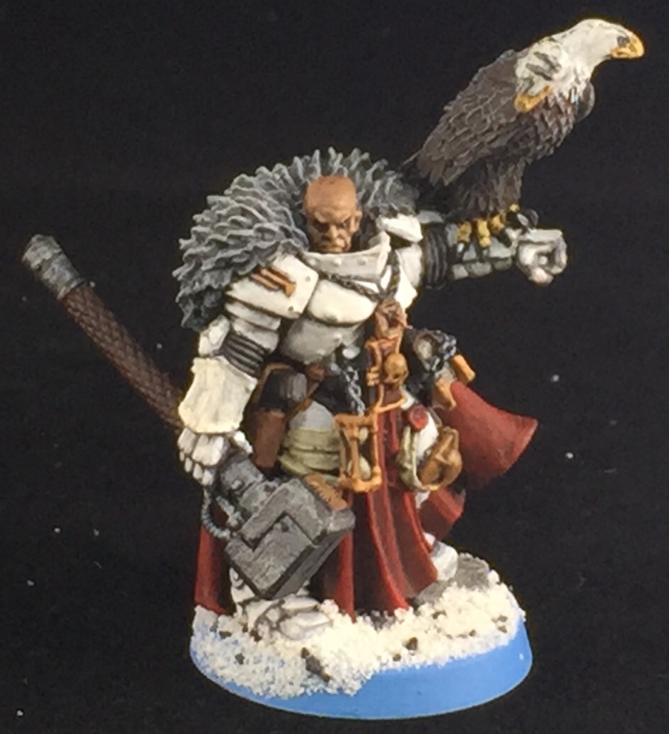 Welcome to the last few models for my Standish Standoff 2012 list. Also the last of my Grey Knights up until the writing of this article at least. I added "The Man" of the Inquisition, Coteaz. He is a heck of a deal for 100 points and brings a lot of function to a list. You all know this its been said before. So on to the important things. PAINTING! I opted to go with White armor. I wanted him to meld in with my purifiers but I felt the black armor was to flat and wanted to do something different. Turns out it gave me a cool grey/black/white color differential between my three inquisitors (see previous articles for the other two). The armor isn't the best to be sure it has some highlighting to it but not enough color depth to really do it justice. Still hadn't gotten into the whole idea that you need to start grey or dark grey to do white, but was starting with a very light grey base coat and going up from that. The washing helped to bring out the details and edgers in the armor so it at least worked somewhat. As stated some number of articles ago, I primarily use the reaper master series of paints. I like that they come in color trios, a shadow, a mid tone and a highlight. Helps to keep coloring the same across an army as your not mixing paint and for an amateur like me encourages me to actually do several layers of coloring.
  What did work however is his red cloak. I think the depth of color on that really came out well and even photographs well. I've always licked this trio and worked it a lot with confrontation models. The blood angel coloring is a brighter red than this but I think this just comes out as a deep regal red. I used my traditional shortcuts for painting gold, painted everything a chestnut gold first as a base then put on the antique gold followed by a black wash. I do this so the gold goes on in one thin coat, the chestnut takes maybe one or two thin coats to cover even black. Its a yellowed brown so higher darker pigment count that covers well. I recommend this to anyone painting gold. Its a great shortcut and perhaps more attainable than using alcohol metallics. Used some basic dry brushing and washing to do the fur and feathers I find for organic materials these rough and ready painting styles work best as they introduce some flaws that all natural things have.
  Next addition to the force was a Techmarine. I didn't have a specific role for this guy other than to get him to man the quad gun with his higher ballistic skill or provide a little support to a unit that needs it. I opted for a deeper red than even the cloak on Coteaz. I felt the martian red would be a deeper brick like red rather than a blood red that GW likes to use all the time. Once more edge highlighting would really transform this model, and when I paint up the other 2 I have I likely will go back to this model to touch it up then. I opted to use a lot of blue for counter coloring in picking out details. This helps him blend in with the Purifiers who have similar coloring on the Psi-cannons. I didn't do much with the servo harness. I ran out of inspiration as well as time and just needed to wrap him up for the event. Picked a few details out in gold and brass but mostly just bolter with a black wash. I think with the next ones I'll use some green with wiring as well and do more brass and copper int he harness to separate details. Also using a brown wash like agrax earth shade on different parts to put a machine oil texture to the model.

 Alright last model for the week my Storm Raven. The paint scheme is somewhat generic and no grey knight bling is on this model as I planned to use it with my Blood angel force as well. I should have added the details would have helped me to break up the model. Once again we can see my struggle to paint large flat surfaces. I just don;t know how to give them color depth like with the cloak. Edge highlighting isn't a tool in my bag yet nor is using an airbrush for anything more than putting a single color down across the whole model. These days I like to use pre-shading along joints and edges before dropping that base coat down with a little surface blending to bring the color up (more on that in future articles). Then I go back and edge highlight. However that is now and this is still 3 years ago. I will say however that the canopy came out great. I did something like 12-13 colors blended across it and it just came out great. Super stoked with the end result. Helps to draw the eyes away from the crappy hull paint job and focus you on something bright and blue and actually painted well.
No comments:
Post a Comment